The Challenge
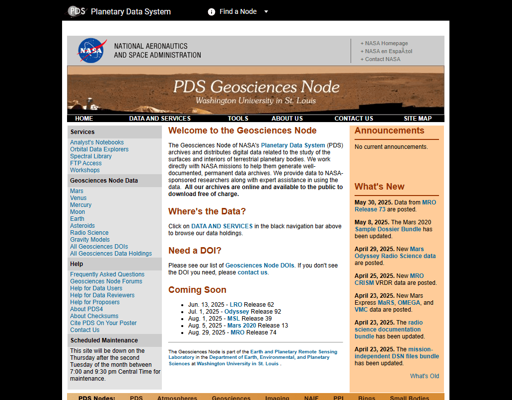
The Planetary Data System is NASA’s open-access archive for planetary science data, supporting a global research community of scientists, engineers, and educators. Though rich in content, the system had grown difficult to navigate, with a fractured user experience that frustrated even its most seasoned users.
From the outset, the redesign project faced major headwinds. Many stakeholders within the PDS community did not support the modernization effort — it had been mandated due to federal requirements, not internal demand. My role as UX lead (and eventually lead of the editorial and development efforts) was to guide the redesign process, advocate for design thinking, and deliver a solution that met both scientific, strategic, and User goals.
The Opportunities
Despite internal resistance, we had clear evidence that change was needed. A large-scale user survey we conducted early in the project surfaced overwhelming feedback about poor usability, disjointed content structures, and difficulty discovering relevant datasets. Users had developed a number of workarounds (ranging from custom built API’s to just directly asking science teams for data) rather than muddle through the current experience. This feedback came not just from casual users but from the PDS’s core audience: planetary scientists and researchers.
This was an opportunity to:
Create a unified experience built around the real workflows of researchers
Adapt NASA’s new Horizon Design System (HDS) to serve a specialist audience
Demonstrate the value of UX through research, testing, and transparent collaboration
The Challenge
The Planetary Data System is NASA’s open-access archive for planetary science data, supporting a global research community of scientists, engineers, and educators. Though rich in content, the system had grown difficult to navigate, with a fractured user experience that frustrated even its most seasoned users.
From the outset, the redesign project faced major headwinds. Many stakeholders within the PDS community did not support the modernization effort — it had been mandated due to federal requirements, not internal demand. My role as UX lead (and eventually lead of the editorial and development efforts) was to guide the redesign process, advocate for design thinking, and deliver a solution that met both scientific, strategic, and User goals.
The Opportunities
Despite internal resistance, we had clear evidence that change was needed. A large-scale user survey we conducted early in the project surfaced overwhelming feedback about poor usability, disjointed content structures, and difficulty discovering relevant datasets. Users had developed a number of workarounds (ranging from custom built API’s to just directly asking science teams for data) rather than muddle through the current experience. This feedback came not just from casual users but from the PDS’s core audience: planetary scientists and researchers.
This was an opportunity to:
Create a unified experience built around the real workflows of researchers
Adapt NASA’s new Horizon Design System (HDS) to serve a specialist audience
Demonstrate the value of UX through research, testing, and transparent collaboration
The Risks
Stakeholder alignment remained a persistent challenge throughout the project. Some collaborators questioned design decisions repeatedly, even those that had been agreed upon over a year earlier. Since this wasn’t a consultancy engagement, we couldn’t “charge” for late-breaking changes. I had to advocate for consistency, document rationale, and reinforce design intent across shifting conversations throughout the entire project lifecycle.
There was also visibility at the highest levels of NASA. I was responsible for presenting strategy, process, and progress to executive stakeholders, including the Science Mission Directorate and Dr. Lori Glaze, Director of NASA’s Planetary Science Division.
This meant the work had to be:
Rigorously justified and defensible
Scalable across an infrastructure supporting a number of different scientific domains
Sensitive to both political and scientific realities
The Solution
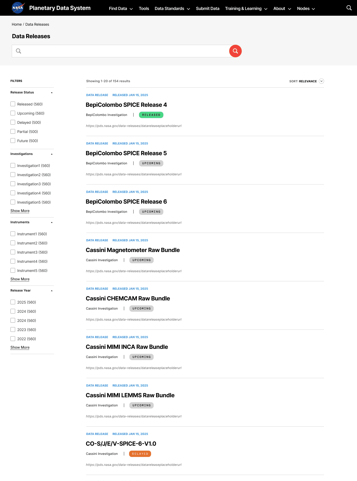
A Human-Centered Redesign for the Planetary Science Community
I led the UX strategy across the redesign while also contributing directly to key interaction and content design decisions. Working closely with two junior designers I mentored, we built the experience collaboratively: testing hypotheses, aligning with development, and refining iteratively.
We structured the site around the distinct mental models and search behaviors of planetary scientists, placing emphasis on:
Research tasks over institutional hierarchies
Access to mission data, tools, and documentation
Cross-referencing datasets and simplifying submission processes

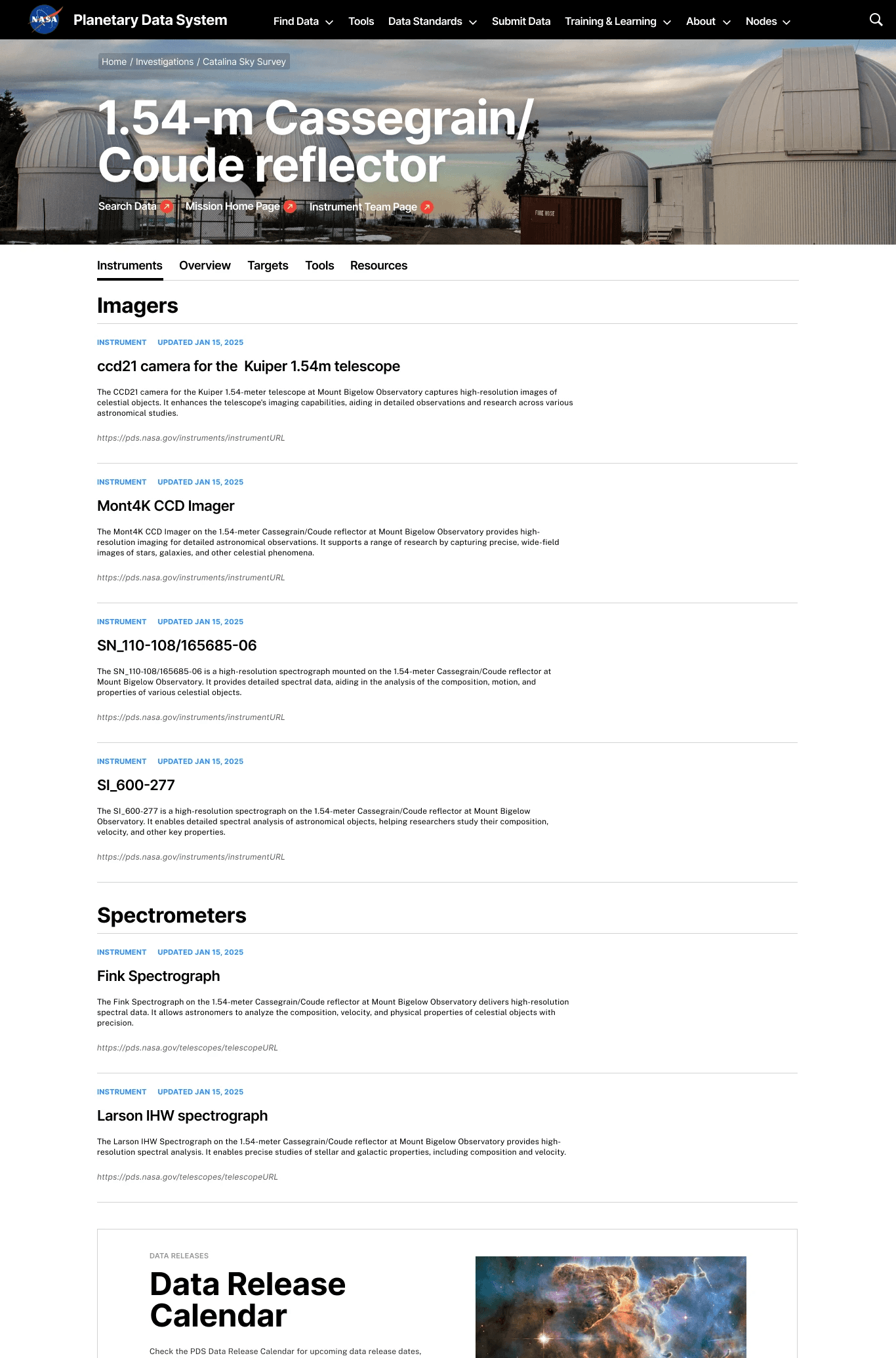
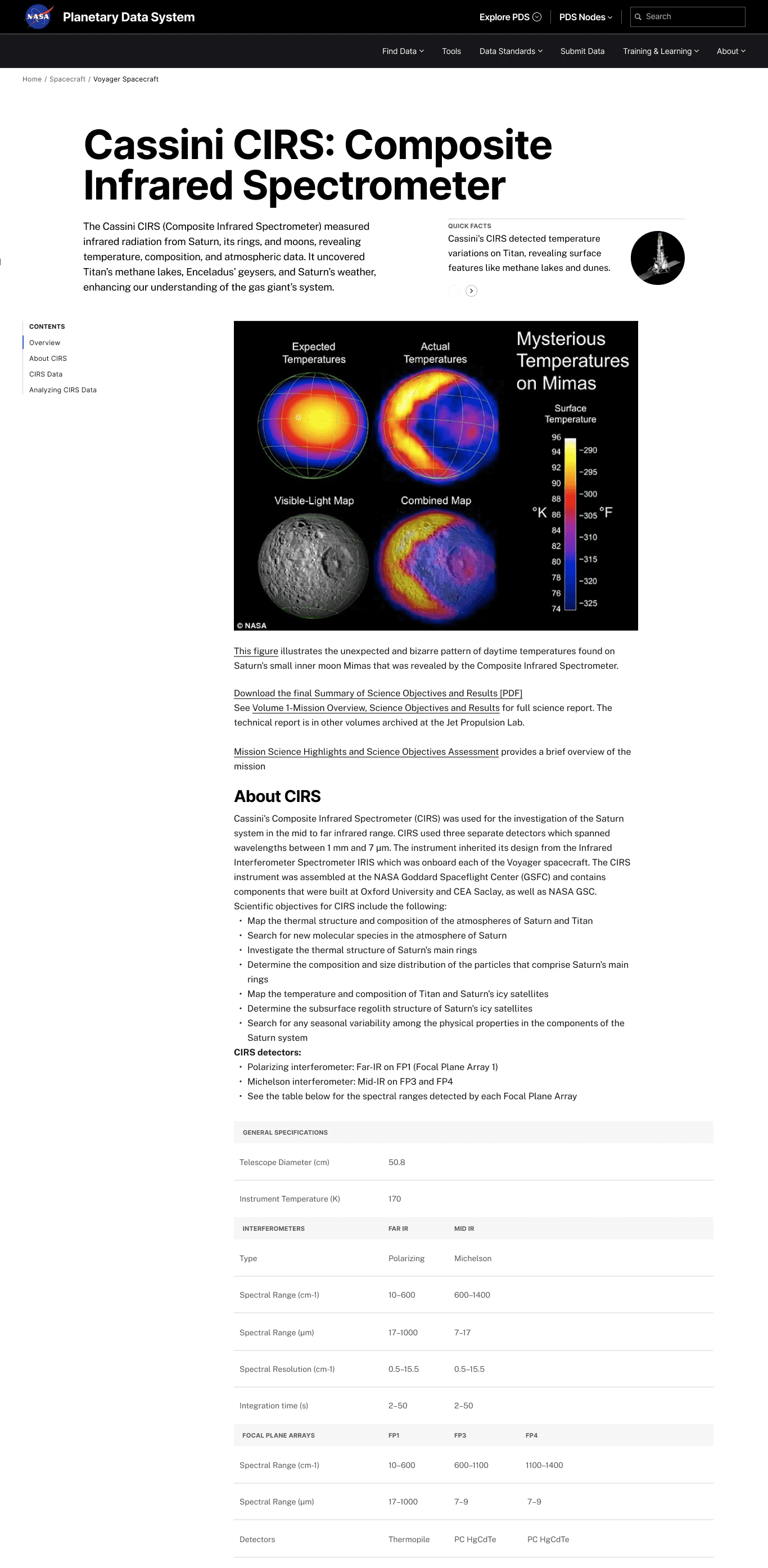
Adapting the Horizon Design System (HDS)
HDS was designed for public-facing NASA websites, prioritizing broad accessibility and general science communication. But the PDS audience had deeply technical needs. We worked creatively within HDS constraints by extending patterns where necessary and documenting adjustments so the integrity of the system remained intact.
This included:
Customizing navigation patterns to prioritize data discovery
Providing clear guidance for search behaviors
Enhancing clarity without oversimplifying scientific content
Real Validation Through Testing
We conducted two major rounds of user testing with a total of 33 participants that included primarily planetary scientists, early career researchers, and international data users. These sessions uncovered key usability issues, which we translated into actionable updates that improved satisfaction, confidence, and efficiency before we launched our beta version in October 2024.
The Outcome
Despite the friction at the start, the redesign launched with strong adoption and measurable improvements in user engagement. Stakeholders who were once skeptical recognized the strategic value of the work. NASA leadership expressed support for the design process and the collaborative methods used to achieve it.
Key results include:
Improved content findability and dataset discoverability
Positive feedback from early-career researchers and scientific staff on the design aesthetics and usability
Strengthened trust in design as a long-term partner within NASA science infrastructure
This project was as much about advocacy as it was about design. It demanded clarity, resilience, and the ability to defend good decisions long after they were made. The full version of the site is launching in Q4 of 2025. It also reinforced the importance of leading from the front by mentoring junior designers, collaborating across roles, and delivering results even when consensus was hard to find.